3 Cheers for Data Viz!
Posted August 5, 2014
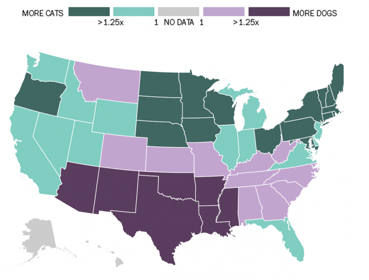
Have you ever wanted a really simple graphic that outlined the relationship across the continental United States of dog versus cat ownership? What about the relative rates of teenage shenanigans from 1993 to 2013? Or, even, a graph that displays the variety and quantity of trees in the boroughs of NYC?
You might not think that you could enjoy such graphics until you see them. And that is one of the greatest things about the explosion of data visualization across the web. The data that reflects our world, the numbers and quantities we create just by living, is pretty when designed well. When laid out in beautiful shapes and diagrams, we can dig into the particles of life, of geography, or culture, and almost any other topic and really enjoy it.
That is why dadaviz.com should be your next obsession on the web. Fast Company posted a brief article about the site calling it the YouTube for Data Visualization. Dadaviz (punny, right?) is a simple, deeply curated, and pleasant approach to collecting and disseminating great data visualizations from across the web. The sources that they pull from range from large news media outlets — NYT and WSJ — to independent producers. This grants a YouTube like democracy to what is presented, no hierarchies, only design standards and the rigors of well presented data.
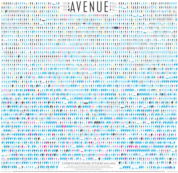
We highly recommend that you bookmark the site and visit it often. You never know when you might need to know about unprovoked shark attacks from 1912 to 2012.
Join The Conversation