Ladies of Liberty: Laura Gunther, Associate Director Experiential Graphic Design at ESI Design
Posted August 2, 2019
Earlier this month, the new Statue of Liberty Museum opened on Liberty Island with experience and exhibits by ESI Design. The new museum is part of a $100 million Liberty Island-wide beautification effort that is funded by our clients, The Statue of Liberty-Ellis Island Foundation.
To celebrate we’re sharing the stories of some of the talented people who have worked for over five years to bring this world-class museum from concept to completion.
In this edition, you’ll hear from Laura Gunther, ESI Design’s Associate Director of Experiential Graphic Design, who worked on the experience and exhibit design for the museum.

Name: Laura Gunther
Job Title: Associate Director, Experiential Graphic Design
Years of Experience: 22
Age: 48
Nationality: United States
Languages Spoken: English, German (comfortably), French (rusty)
Education: BFA in Graphic Design and BA in French from Indiana University, and a MFA in Design from the School of Visual Arts.
What was your first encounter with the Statue of Liberty?
Laura Gunther, Associate Director of Experiential Graphic Design: I had been to Ellis Island many times before, but until I started working on the Statue of Liberty Museum, I never got off the boat at Liberty Island to see the Statue up close. Without a ticket to go all the way to the top, I opted to admire her from the boat.
Early on in the design process, we arrived on a crisp autumn morning before any visitors, and I had the privilege of climbing to the top of the crown and seeing the world as Lady Liberty does. It was breathtaking. I remember feeling a sense of awe. It was like the first time I saw other world icons, such as the Eiffel Tower or Taj Mahal, up close. But there was something special about the Statue of Liberty, something more intimate. I was intrigued that a massive statue could feel so immense and so human at the same time.
What was your role on the project? What did that mean for you day-to-day?
LG: As the visual designer on this project, it was my job to consider the look and feel of all printed and environmental graphics, from the informative panels, large wall graphics to the building signage and museum logo.
The logo was one of the first things I worked on in the museum design process, during the Concept Design phase. As an internationally recognized icon, designing a logo for the Statue’s museum presented a rather daunting task. How do you represent the actual Statue of Liberty, when it is already used to brand every possible business under the sun (car dealerships, insurance companies, sodas, funeral homes, and more.)? How do you embrace history while looking forward? We explored type lockups with and without representations of various parts of the Statue. In the end, the client felt strongly that we should include the torch, partially because it is used less in other logos, but mostly because the Statue is titled “Liberty Enlightening the World.” The torch represents the idea of a global beacon best. I drew a stylized torch in two formats to allow for scalability of the logo. Next we chose two typefaces to pair with the torch: Ronaldson (a historic typeface) and Museo (a contemporary one). To accommodate a range of brand needs, I developed three logo formats (stacked, horizontal, and torch-centric). Like many logos, it seems like a very obvious solution, but it was a challenge getting there.
There were also some shocking moments during the construction and production of the museum. At one point, we realized the dimensions on the drawings did not match the built environments, and therefore the graphics produced for those areas did not fit. As you enter the museum, there is a supergraphic showing the statue’s face up close at full-scale. In the shop drawings, the wall was at least 8’-0” taller than the final built wall, allowing plenty of space for the full-scale face and crown. However, when the mural was hung, the installers simply started at the top and unrolled it to the floor, cutting off the excess, and critical part of the image. Fortunately, we were able to rework the layout, maintaining the full-scale of the face, and reprint the graphic.
The funny thing about this incident was that no one else noticed this literally enormous error. Even if they weren’t disturbed by Liberty’s jaw resting on the floor, I would think they’d have noticed that the accompanying text was only a foot off the ground, making it very awkward to read. Yet at least five people who saw the graphic beforehand told me the mural looked great. This drives home the importance of collaboration. We all see things through our specialized lenses, and need to be advocates for our areas of expertise. Only then can we create a beautiful, holistic design.
You just opened a new museum for the Statue of Liberty — how does that feel? What does that mean to you?
LG: I feel extremely fortunate and proud to have played a key role in such an iconic, historic project. Working on the Statue of Liberty Museum during a time of political dissonance has reminded me of the noble principles our country has represented in the past. The statue embodies these ideals and inspires me to have hope for the future.
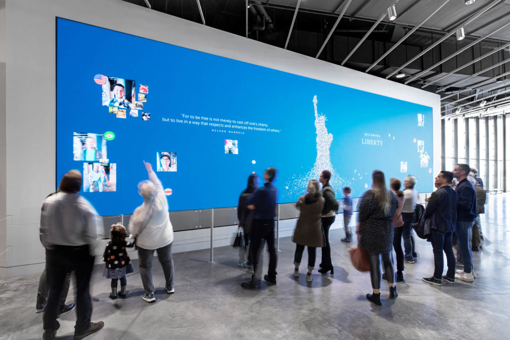
I love that the museum presents a nuanced view of Liberty. It recognizes that “Liberty” does not mean the same thing to all people worldwide and that those interpretations change over time. I wouldn’t want to be part of something that aimed to glorify the United States while overlooking our faults. The museum speaks directly to the fact that not everyone within our country has had access to the same freedoms as others, calling out the hypocrisy of building a colossal female statue celebrating Liberty, while denying basic rights to women and people of color.
Through working on the graphic panels and reading all of the content, I have learned so much about the complex story of the Statue and all she represents. It is an essential, inspirational story that needs to be accessible to everyone. With the opening of this museum, millions more people will now benefit from the Liberty experience.
Why is having a museum dedicated to the Statue of Liberty important?
LG: A museum that explores all of the facets and interpretations of Liberty will always be relevant. The museum reminds us of the virtue of human beings. It is a symbol of friendship. A symbol of abolition. A symbol of immigration. A symbol of equality. A symbol of rights. It inspires us to aim higher.
The museum also illustrates the power of imagination. The story of the conception and building of the statue is incredible. It was an extremely ambitious and laborious feat. As ESI Design’s founder Edwin Schlossberg said, it really was a realization of the impossible in terms of scale, number of people involved, likeliness of failure, money needed, coordination, engineering required, building and rebuilding and refurbishing.
It is a massive achievement that encourages us to dream enormously.
After working on this project, has your concept of liberty evolved?
LG: The flexibility of the idea of liberty has impressed me most. The way it’s changed over time and the way it means something different for everyone.
Mostly, I’ve realized the value of liberty, no matter how you define it. It’s a fundamental human right we take for granted. We need to treasure, protect and share it.
Do you have a unique/special connection to Lady Liberty?
LG: She feels like an old friend! She’s been familiar to me for as long as I can remember. Long before I saw her in person, I knew who she was, and part of what she represented.Working on this museum was like a homecoming experience – not as dramatic as immigrants crossing the Atlantic to start a new life or GI’s seeing her as they returned from war, but certainly deeply personal.
On a lighter note, when we first moved to NYC, I bought a Statue of Liberty lighter for my husband. When you push down on her tablet a flame comes out of the torch. It’s a silly thing, but we’re both very fond of it. It’s the only knick-knack that has remained on display in our apartment for the entire 20 years we’ve lived here. One aspect of the museum I really appreciate is that this love of the Statue as a keepsake is not a new idea, which is represented in the Embracing Liberty exhibit through artifacts and media. From the very beginning, Bartholdi allowed representations of her to be sold to help with the fundraising of the Statue. Everything from cheese wheels to spoons to Tiffany-style lamps to quilts to Legos. And it’s not just physical objects, it’s advertisements, political cartoons, and propaganda too. It’s incredible to see how widespread her image is.
What were the steps in your journey to this iconic project?
LG: Through my MFA program in Design at the School of Visual Arts, I discovered my dream job. I was a graphic designer before starting the program, but I was uninspired and pigeon-holed into a niche I didn’t want to be in. During a studio visit to ESI Design in the second semester of my first year, I met Edwin Schlossberg and ascertained that I wanted to work for him some day. I then forged a thesis path to make sure I would move in the direction of experience design. Through good fortune, I succeeded. Ed became my thesis advisor and several years later hired me.
Over the years at ESI Design, I have worked on many interpretive projects such as Tryon Palace, Edward M. Kennedy Institute for the Senate, Dream Cube World Expo, and the Ellis Island National Museum of Immigration. I worked my way up to lead the EGD and print design group. When I heard the Statue of Liberty Museum project was starting, I requested to be on the project. It was the only time I’ve ever asked to be on a specific project and I’m so grateful that ESI granted my wish!
Since you started your career, what’s the biggest change you have seen in the world of design?
LG: Technology.
For the most part it’s been an improvement, but it brings some disappointments too. In particular, I miss having contact with the physical process of graphic design. There was a lot more hands on design exploration in the past. Literally cutting and pasting. I used to love going to the lithographer to check films or go to the printers for a press check. The smells, the sounds, and the wonder of seeing four colors combine to produce full-color images and words. It was magical.
Technology has also brought more accessibility to tools. And those tools are more powerful and intuitive. The advantage of this is now I can learn skills quickly that would have required years of training and specializing before. The disadvantage is that anyone can call herself a graphic designer now, empowered with just a laptop and Photoshop, without knowledge of composition, color, or typography.
Also technology enables collaborative work. We take advantage of this all of the time at ESI Design. I don’t know how we survived without Google docs!
What advice would you give to your younger self starting a career in design?
LG: You can do it, you know you can. Trust your instincts. They’re right. Don’t worry about sounding stupid or making mistakes. I believe in serendipity and greatness coming out of botched attempts. Take the time to really explore ideas, learn to be more mentally flexible, and let loose a bit. What you do now will lay the groundwork for what you do later. Make it count.
Ask questions. Your fellow designers are an amazing resource and inspiration. I learn so much from my peers, even after over two decades as a designer. We all are answering the same design questions, but we all do it completely differently. The variety of approaches and solutions is fascinating and eye-opening to me. And when others criticize, rather than resist or get defensive, embrace the opinions of others. You don’t have to follow their advice if you don’t want to, but at least listen. This requires a lot of maturity that is difficult to muster at times.
Do some research before taking a job. You need to feel good about the work you are doing, not just that it’s beautiful design, but that it’s meaningful. If you’re in a position to choose, then work for a place that embraces the values that are important to you. How much does the company value its employees? What benefits do they offer? What is the work/life balance? What are the principles they put forth? Who are their clients? Do those clients represent virtues that you embrace?
As for women specifically, the days of mostly-male design studios are ending. Over my 20+ years of experience the balance has shifted. While I believe men are still benefiting from a biased system and that the gender pay gap hasn’t vanished, the status quo is changing for the better. If your employer isn’t heading in the direction of equality, move on. Your talents would be put to better use at a place that appreciates you completely.
If you were giving a tour of the new museum, what would be your top highlight?
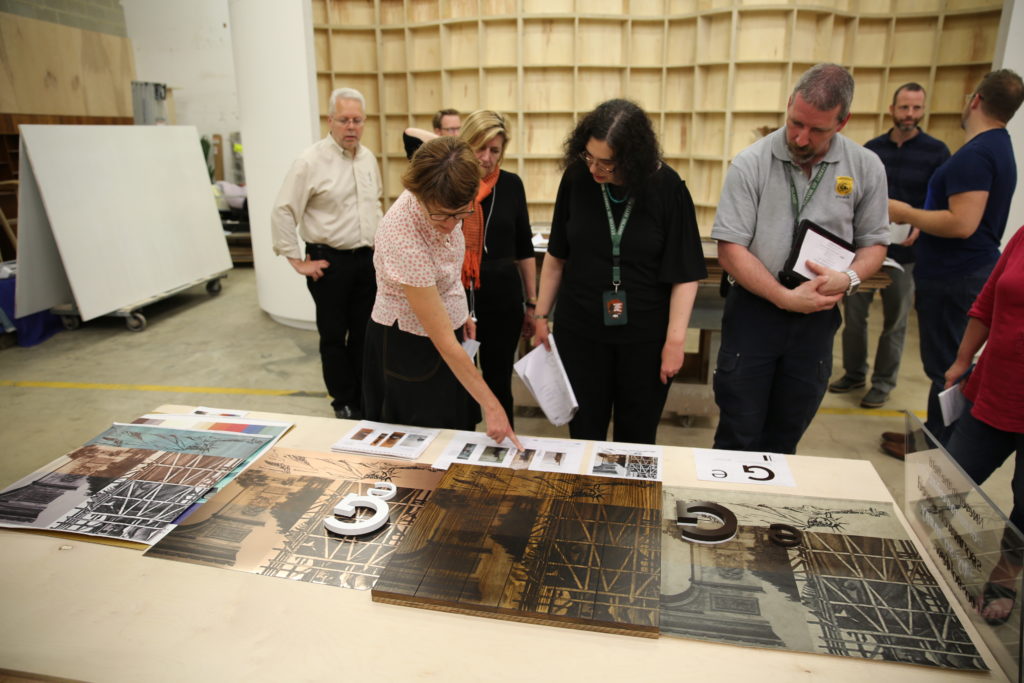
LG: We put a lot of care into reflecting the physical aspects of the Statue of Liberty through the elements within the museum. There is a theme of materiality that runs through the museum, that may not be noticed by all visitors, but does add to the overall immersive feeling. Beginning with the palette, we looked at the colors of the statue, from the golden flame, to the fresh copper, to the patina copper, to the dark brown iron bars. We used the physical forms of Liberty’s robes to inform the curving shapes of the walls. We chose materials for the graphics and wall finishes that reflect the progression of the Statue’s construction, from plaster model to wooden frame to brand new copper to the green we all associate with her. These elements enhance the story of Liberty told with all of the words and images on the panels.
In particular, I like the artifacts at full scale. Seeing a 4-foot tall ear is impressive. Comparing my foot to the massive toes of Lady Liberty is fun. Looking head-on into the steadfast gaze of a massive face is intimidating.
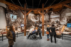
I also like the way the enlargement process is explained in the Constructing Liberty exhibit. It is an involved story which illustrates how Bartholdi went from a small model in his studio to a colossal statue, rising out of his workshop and towering above the rooftops of Paris. Building off the exhibit from the previous museum, using models of the foot to demonstrate the process, we took it a step further by rearranging artifacts to make a clear connection from the small molds to the full size foot. We then enhanced it by creating a workshop-like environment to house the artifacts, with actual life-size photos from Bartholdi’s workshop covering the walls. Animations are projected on to the images calling out key processes and tools. Finally, we hired a sound designer to recreate the sounds one would have heard back in 1883 in that Paris workshop.
To read the rest of the interview series, click here. If you have any questions for Laura, sound off in the comments!


Join The Conversation