New Ways of Transforming Data Into Visually Compelling Infographics
Posted June 17, 2015
What are the top 500 passwords? What nutritional supplements are beneficial and which are snake oil? How many alien civilizations are there in the galaxy? One could mine through piles and piles of data spreadsheets to find the answers to these questions, or you could use that same data to create a visually compelling data visualization that easily communicates and tells a story.
At ESI Design, we use creative infographics in a lot of different ways, from client-facing presentation visuals that show an aspect of a design process or user experience to public-facing infographics that condense and convey large amounts of information in an easily understandable way. (Take a look at some of ESI Design’s work at the Edward M. Kennedy Institute and the AT&T Media Lab).
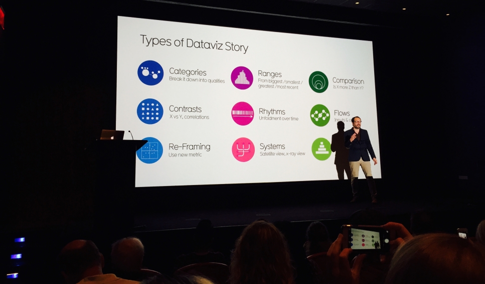
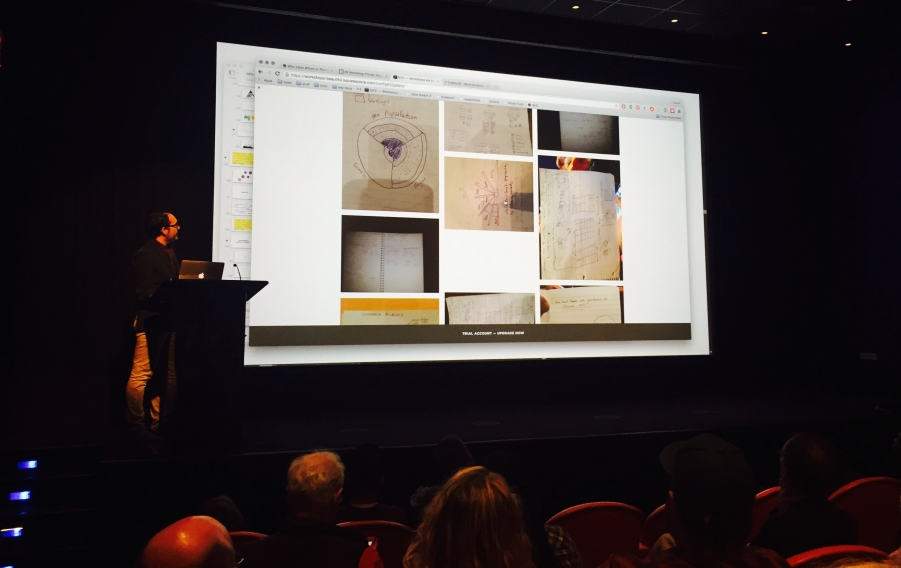
We’re always looking to develop new ways of turning data into visually compelling infographics here at ESI Design, so I recently attended a data visualization workshop given by David McCandless, the designer and blogger of Information is Beautiful (http://www.informationisbeautiful.net/). This half-day workshop gave an overview of the design process that David McCandless has developed in creating successful static and interactive infographics using large and varied data sets. The workshop combined lecture time with collaborative sketching. During the sketching portion of the workshop, we broke into teams of two and sketched our own infographics by applying various techniques that McCandless utilizes in his own design process.
One of the most powerful points made during the workshop was that selecting or defining different data sets leads to the creation of graphics that communicate vastly different information. McCandless showed the audience a study in which he used the data of an array of countries’ army populations to show which country had the biggest army (China). But when he created the same graphic using each country’s general population alongside army size, a completely different picture emerged (North Korea topped the list, while China fell to 124th on it).
Improving and evolving the strategies and techniques for creating successful data visualizations is important in today’s design-savvy, and data-generating culture. Audiences expect their information, whether medical results report or a news report, to be visually engaging and easy to comprehend. The immense amount of data created every day in the form of photos, user input on web sites, social media – can all be translated into infographics to show behaviors.
Join The Conversation