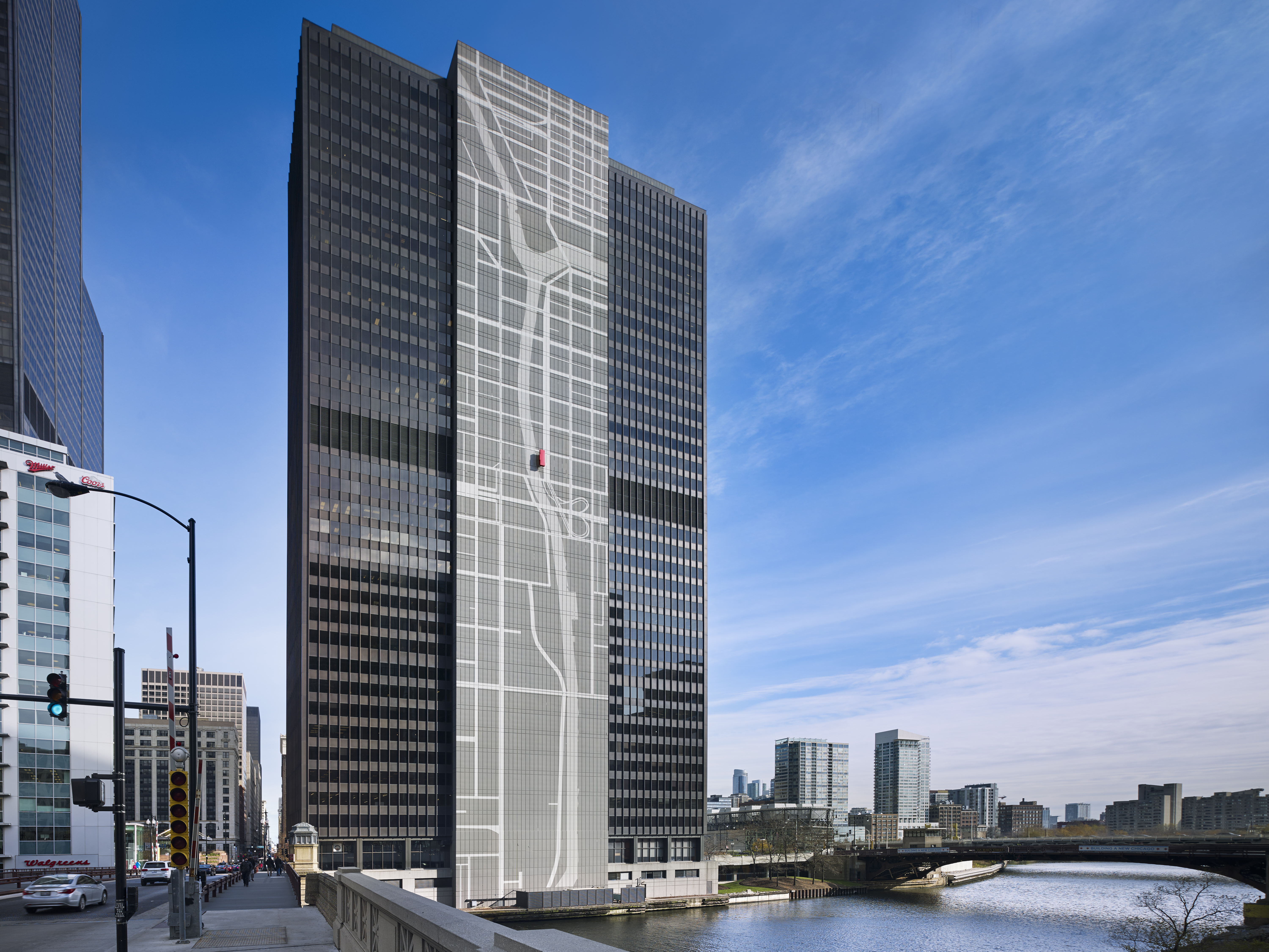
The centerpiece of the design is the larger-than-life map on the river-facing side of the building showing its location within the city, which has made the building a must-see landmark on city tours.
Challenge: 300 South Wacker Drive in downtown Chicago needed a new identity.
Solution: ESI Design envisioned a map theme that would highlight the building’s connection to the city and the river. The resulting design features an eye-catching 40-story mural on the outside of the building and a bright, inviting entryway and lobby.
The centerpiece of the design is the larger-than-life map on the river-facing side of the building showing its location within the city, which has made the building a must-see landmark on city tours.
The map theme continues inside the lobby with a cut-metal, forced-perspective depiction of the neighborhood on the walls, placing the building in its urban context. The deep blue of the Chicago River weaves its way through the gray grid of the streets.
In addition to the map, synchronized media installations on the two side walls and in each elevator bay show a continuous loop of local content. The custom media includes weather information, event listings, community-related images, and building identification, with each template blending into the physical context and lighting effect of the lobby. Finally, a new bright red building identification enlivens the glass entryway, front desk, and rear wall.
Result: The combination of these elements transforms the lobby into a glowing white box visible from the street both day and night. “[The lobby] brings people together a lot more than it used to,” says Jim McCarthy, a tenant at 300 South Wacker for nearly 20 years.
"The transformation of this building has been a significant factor in bringing in more tenants."

The centerpiece of the design is the larger-than-life map on the river-facing side of the building showing its location within the city, which has made the building a must-see landmark on city tours.
Challenge: 300 South Wacker Drive in downtown Chicago needed a new identity.
Solution: ESI Design envisioned a map theme that would highlight the building’s connection to the city and the river. The resulting design features an eye-catching 40-story mural on the outside of the building and a bright, inviting entryway and lobby.
The centerpiece of the design is the larger-than-life map on the river-facing side of the building showing its location within the city, which has made the building a must-see landmark on city tours.
The map theme continues inside the lobby with a cut-metal, forced-perspective depiction of the neighborhood on the walls, placing the building in its urban context. The deep blue of the Chicago River weaves its way through the gray grid of the streets.
In addition to the map, synchronized media installations on the two side walls and in each elevator bay show a continuous loop of local content. The custom media includes weather information, event listings, community-related images, and building identification, with each template blending into the physical context and lighting effect of the lobby. Finally, a new bright red building identification enlivens the glass entryway, front desk, and rear wall.
Result: The combination of these elements transforms the lobby into a glowing white box visible from the street both day and night. “[The lobby] brings people together a lot more than it used to,” says Jim McCarthy, a tenant at 300 South Wacker for nearly 20 years.
"The transformation of this building has been a significant factor in bringing in more tenants."