ESI Design uses Experiential Graphic Design to Enhance SoCal Corporate Campuses
Posted November 4, 2019
Prior to its reinvigoration, the office building at 5161 Lankershim Boulevard in North Hollywood had something in common with the corporate structures at 5220 & 5230 Pacific Concourse in El Segundo, California — the properties were outdated and went unnoticed by passersby in bustling Los Angeles traffic. Recognizing the client’s struggle to retain and attract tenants to the buildings, ESI Design used several experiential graphic design strategies to give the two campuses a new commonality — their status as modern SoCal workplaces.
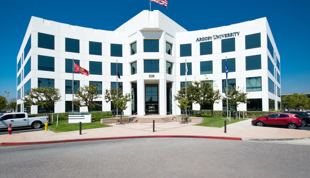
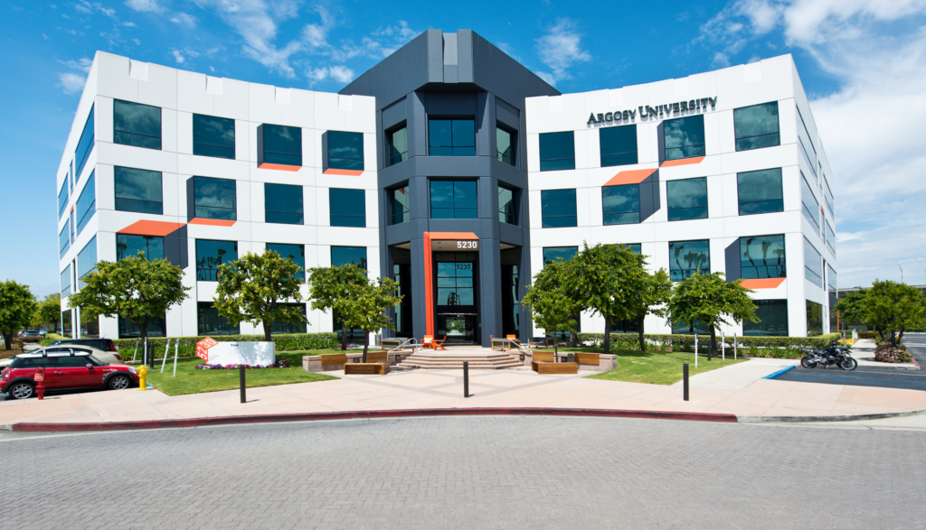
Before and After: 5230 Pacific Concourse
Creating Modern Destinations
Extremely large graphic treatments, called “supergraphics,” were used to help establish an identity for both of the properties as dynamic centers for creativity. Supergraphics use vibrant colors and building-sized graphic elements to become the most dominant architectural feature of a building.
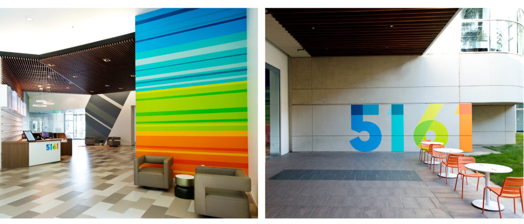
At 5161 Lankershim, a color band motif leads visitors through the space. The brightness and shape of the graphic treatment reflects the type of tenants Beacon Capital Partners hopes to attract to the space — makers and animators from creative and tech industries who were previously reluctant to work in a place that may have been perceived as too corporate.
“The concept for 5161 Lankershim draws on the idea of a film strip, which can be seen in the swooping diagonals,” says Robin-Davis Burke. “We wanted to play off of the animation and video studios in the area, and give a subtle nod to their work.”
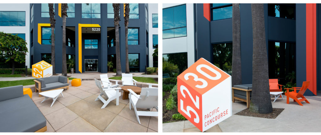
Illusion and depth are key elements in the experiential graphic design treatment for the buildings on the Pacific Concourse campus. Playful painting around the buildings’ windows creates the illusion of three-dimensional boxes jutting out from the structures, an eye-catching feature visible from the road. This illusion was an efficient way to provide value to the client without requiring a large budget in order to make an impact. Three-dimensional illusions are also present in the signs at the entrance of the buildings, which look like cubes despite being made from flat materials.
Establishing an Identity with Supergraphics
The two Pacific Concourse buildings presented a unique challenge for the ESI Design team in that they were originally part of a set of three near-identical office buildings.
“We had these three buildings that looked identical, but one of the design challenges was that our client only purchased two out of the three. We had to find a way to keep the buildings as a set but distinguish two of them. We decided to use a large environmental graphic treatment to keep the buildings feeling like a cohesive unit, but give our client a low-maintenance way to make their properties stand out,” Davis-Burke says.
The illusionary entrance signs were also designed with this challenge in mind — ESI Design created a flexible identity system for the Pacific Concourse buildings in case the client chose to purchase the third building in the future. The cube-like signs were created as a consistently branded set that could be used in marketing collateral both separately and together as part of ESI Design’s commitment to providing the client with long-term value.
Before and after: 5161 Lankershim
Experiential Graphic Design Choices
Signage and wayfinding are two of the most important aspects of experiential graphic design, also known as environmental graphic design, according to Davis-Burke. While playful pops of color are crucial to both projects, maintaining an intuitive path throughout the space so visitors always know where they are going can be a challenge when bold colors have the potential to be distracting.
“We always want to make things an exciting color to make them stand out, but you also have to make it bold in such a way that people will naturally follow it as they move through the space,” Davis-Burke says. “It’s important to create wayfinding that feels invisible, which is counterintuitive to what you might think. You shouldn’t have to think about wayfinding when you’re navigating a space. If you’re thinking about the signage, it’s probably because you’re having a bad experience.”
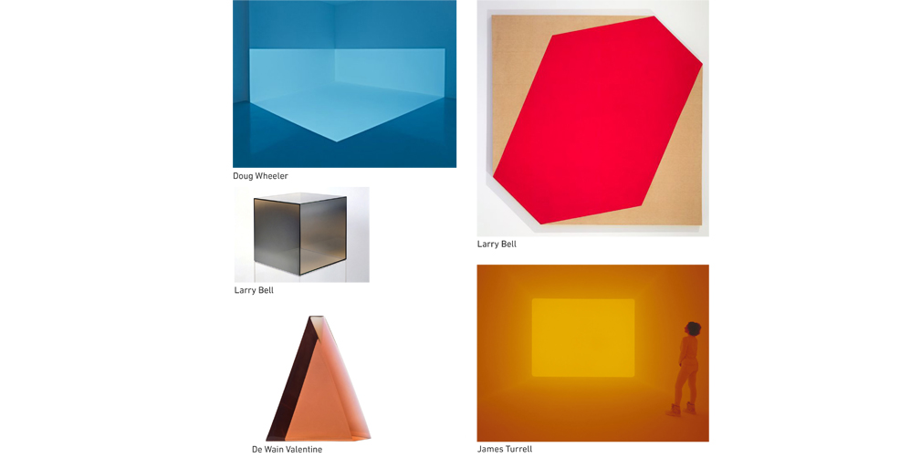
Reminiscent of LA’s art scene in the 1960’s, the bright colors and angular shapes used in the experiential graphic design for the Pacific Concourse buildings were inspired by the historical Light and Space movement.
“SoCal is a historical center of op art, so our concept to draws on that history and creates an illusion of depth like this art style,” Davis-Burke said.
“New” Corporate Campuses
Davis-Burke believes that supergraphics are one of the most fun elements of experiential graphic design, but working with building painters instead of mural artists meant that she had to provide extremely detailed instructions to the on-site painters at 5161 Lankershim. She sent several copies of meticulous drawings to the painters depicting exact angles and landmarks on the existing structures to follow to ensure that the supergraphics were implemented as intended. The outcome of this process was so successful that the same painters were hired to complete the Pacific Concourse project.
“We have the expertise in house at ESI Design to advise the painters,” Davis-Burke says. “Not all painters are experts in mural work, but with guidance from the ESI Design team, we had fantastic results.”
Davis-Burke explained that one of the key measures of success for the experiential graphic design details in both projects is how people interact with the spaces. The reinvigoration of the three properties has been so drastic that the buildings’ street presence has led some people to refer to them as “new.” While the structures existed long before they were known as bright, inviting landmarks, Davis-Burke is proud of how many visitors take photos in front of new the supergraphics, and is happy to hear the tenants’ praises for both the outdoor and indoor designs, pictured below.
“People love to take photographs of the colorful walls; they stand in front of them and take selfies,” Davis-Burke says. “You can see all of the buildings from down the street, and they have quite the presence.”
Join The Conversation